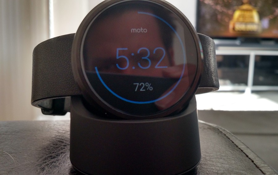
Wearables couldn’t be hotter right now, with the established product category a couple of years old, devices are getting increasingly interesting. There’s impending launch of that watch from Coopertino, this month, but before then, we’ve spent a couple of weeks with Motorola’s Moto 360. The device is made by a company owned by Google, so the products that emerge come with an expectation that other’s don’t, particularly considering the hardware is only half the battle, it’s the software ecosystem of Android Wear that really dictates it’s usefulness.
The MotoX is Motorola’s current flagship, making it the perfect compliment to test the Bluetooth sucking wearable that’s hear to stop you pulling your phone from your pocket 347 times per day.
Hardware
The device itself is round to make the transition from a dumb watch, to a smartwatch easier aesthetically and it works. Most manufacturers are taking the easy way out and shipping square or rectangle faced displays, not because that’s better for users, but because well established display production techniques mean higher yields.
The 1.56” round display is fantastically bright and easy to read. The graphics and fonts are crisp and detailed thanks to the 320×290 resolution which translates to 205 pixels per inch. At around 1.5cm tall, the watch is noticeably big on your wrist, but as a 6”3’ guy, it’s really not a problem, if anything it’s a conversation starter, but future models definitely need to get slimmer.
Packed inside that medium-quality body is a TI OMAP 3 processor, 512MB RAM, Bluetooth 4.0 LE and , 4GB of internal storage. There’s no microSD expansion, that’s it, but as most things live on your phone, it’s adequate. There’s also a vibrating motor to alert you of notifications, dual microphones so you can yell “Ok Google” or reply to a message via voice, however this does struggle in even minimally noisy environments, the in-line mic on your headphones is far better.
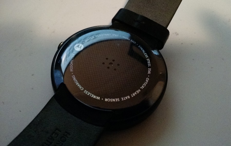
Technically the watch is water resistant, which might survive a sweaty run while its pedometer and optical heart rate monitor check your vitals, but not a tour to the shower with you.
Battery life
One of the biggest questions about wearable devices is the battery life. Naturally squeezing high capacity batteries into such a small form factor is a challenge of monumental proportions. Thankfully Motorola engineers have done a great job on battery life with the Moto360, the tiny 320mAh is supposed to last you all day and I definitely found it did.
With an always-on Bluetooth connection to your phone, that low-energy clearly lives up to it’s name. There’s no question in my mind, this product could have existed 3 years ago.
Charging dock
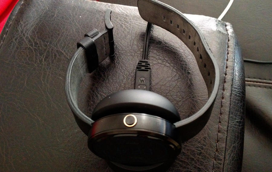
When the watch does run out of battery you’ll need to charge it with the supplied dock. It’s a wireless dock, so placing the watch down is simple, but does lack the freedom of a micro-USB connection. Basically this means if you go on an overnight or holiday, you’ll be lugging this dedicated watch charger as well as one for your phone and probably tablet. It’s time we had a wireless charging bowl on the bedside table we can throw all the flat devices in.
Side note, if you were really keen to use apps on your flat watch, you can’t, the watch enters a charge mode and is unresponsive to human interactions while getting juice.

Wearability
The watch comes in a number of options, including Silver, Black and leather or metal bands. The base model weighs just 49 grams and as someone who hasn’t worn a watch for 20 years, it was a noticeable weight at first. After a few days I reached the point where you’d forget you were wearing it, so weight is definitely not an issue.
To wake the device, the theory is you can just rotate your arm, just like you would if you were checking a regular watch and the display would wake from sleep. In reality the motion required to wake it means you’ll have a much more obvious arm movement. There’s no subtle way to check the time during an extended conversation that won’t end. Of course you can tap the display to wake it, but that’s equally overt.
There is an option to keep the time displayed on the screen the whole time, but given it’s an LCD and not OLED, this would chew through battery life to power all pixels, never mind 95% of the display could stay black, the technology doesn’t allow it. Hopefully we do see OLED displays reach wearables in the couple of years, as there’s great quality and power savings on offer, the question is simply price.
The flat tyre
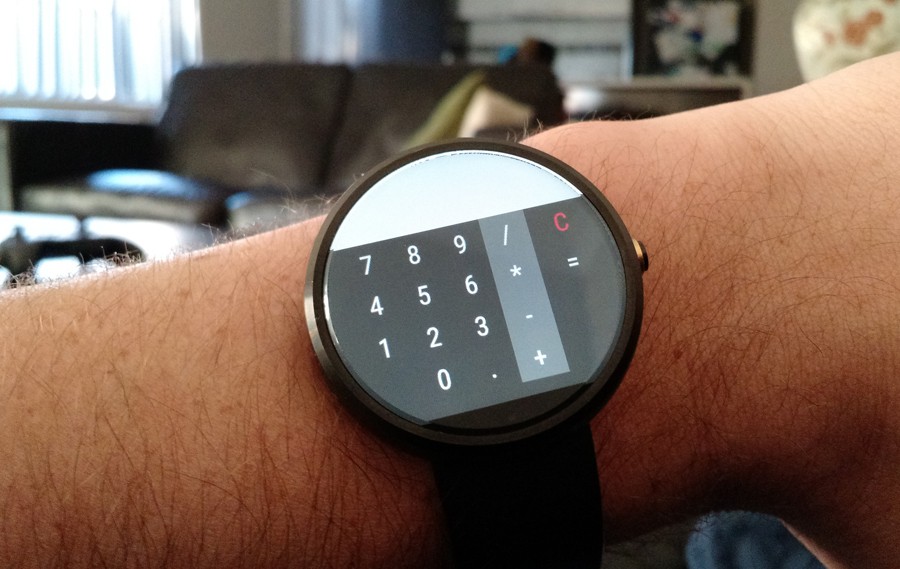
At the bottom of the screen, there is a section of the display that is black. It’s not a button, it doesn’t do anything, it’s just, kind of there. Some people I showed the watch to absolutely hate it, to the point where my explanation of the watches features ended when they spotted it. Personally I stopped seeing it after about the 3rd or 4th day and wasn’t concerned by it, only that a developer should be able to assume a round display is fully round and they could use every pixel available without having to plan around the UI for one specific model.

Software
Android Wear now powers 6 watches and supports both the round and square display types. After downloading a number of ‘Android Wear compatible’ applications, you quickly realise that there’s no restriction by Google on the type of app that can be installed on a Android Wear device. As we mentioned earlier, square (or rectangle) displays are by far the most common and developers will always shoot for the largest market. This means the number of applications specifically supporting round displays is quite limited.
Wear as a platform is great, it includes all the immediate tasks that come to mind when you think about what a watch/phone pairing could do to enhance your life. Set and control alarms, add reminders, take notes, get notifications, screen calls, monitor your workouts, control your playlist and much, much more.
Choosing watch faces is something you’ll spend an embarrassing amount of time on and probably some money. After exhausting the stock options, I headed to Google Play to find some new tick tock. There’s of course a blend of analogue and digital and some that contain widgets like weather and lunar cycles. There’s also a mix between free and paid and one particular favourite was in the design of a ventilated disc brake and a close second was a Matrix-style face. Changing watch faces is a fun and will keep the device fresh, long into it’s life. It’s that piece of personalisation that’s overt, seen and noticed by others, it’s a far bolder statement on who you are as a person than the wallpaper on your phone.
User experience
There’s definitely a learning curve with Android wear. It’s full of swipe gestures to get around, a natural alternative to complex navigation options when the screen real estate isn’t available. Swipe down to get to options, swipe up to go through notifications. Swipe left to see additional info (or generally the button to open the app on your phone).
It is neat being able to control your phone from your watch, but if you have a PIN code on your phone, the remote app launch is ruined. It is neat that context sensitive applications fire into action when you need them. Launch the camera app on the phone you’re connected to and the watch automagically switches to a tap to shoot camera app.
In terms of starting app you install on the Moto 360, the app list is surprisingly buried. To control an app like PocketCasts, you tap the screen, tap in the middle of the display to bring up the menu, scroll all the way to the very bottom, then tap the …Start.. option, then find the app in the list and tap to open the app. Technically you can open apps with your voice, but I had varying levels of success and once you lose confidence in voice commands, you’re unlikely to go back, especially if that means holding your wrist to your mouth and talking to it whilst in public.
One of the best moments of the my time with the Moto 360 was using it to control the volume on my SONOS sound system. This was a task I’d typically have to pull the phone out for, enter the pin to unlock, launch the app, and adjust the controls, but with the watch it was made far easier, far less steps.
Fitness
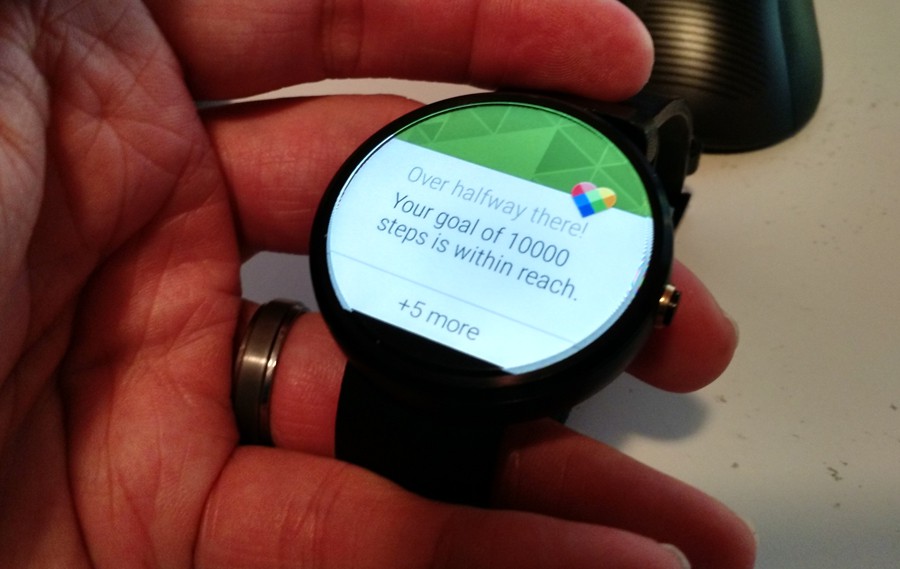
The fitness apps built into Android Wear are decent, but do have room for improvement. They track your active hours, steps etc, but there’s nothing in terms of sleep, so fitbit shouldn’t be worried just yet. Android Fit allows you to set goals, get motivation reminders to go achieve them and a rewarding buzz when you hit 10,000 steps for the day. There is no sharing from the watch, no screenshot capability (what is that button for anyway?), so you’ll have to fire up the app on you’re phone for that or awkwardly take a photo of your wrist before the sleepy display turns off to save power.

Price and Availability
The Motorola MotoX is available from Office Works and a bunch of other electronic retailers. Prices start at $319, but most places you’ll pay retail at $329 and it does include the charger. Expect to pay a little more for the metal chain linked band, up to $399.
You will need an Android phone running 4.3 or higher to pair with the Moto 360. If you have a non-Android phone, forget it.

Overview
The Motorola Moto 360 is a great wearable at a great price. There are no surprises here unfortunately, it’s exactly what you’d expect and nothing more. Actually there are plenty of times where the functionality breaks down. Far too often I found myself being asked to reach for my phone. If my friend liked my post on Instagram, I had to pull out to see the photo or comment.
If I received an email from the boss and 12 others from mailing lists or press releases, that’s great information, but there’s no way to review the important one and certainly no way other than voice to reply. There is no direct headphone jack on the watch that could leverage the in-line microphone, this would allow the voice dictation to be far more accurate as the mic would be far closer to your mouth.
The designers did a great job with the Moto 360, it’s a solidly built device, perfectly walking the line between better than cheap crap and a ludicrous $24,000. The build is strong and making the watch more like traditional watches will assist in the process of wrangling the analog from people’s wrists and replacing it with a smart watch.
Just like the transition we made with phones, there’s a mental adjustment that needs to be made when moving to a connected device with a display, you need to accept you’ll charge it nightly. Once you get over that, you can enjoy you’re unnecessary but very cool purchase. We’re way past what we need in life and well into the what we want category and wearables is something I want. They have the potential to make life easier and I sincerely hope we’re surprised by the functionality that arrives over the coming months and years.
What’s possible now is functional and does help you screen your mobile life. It lets you put off the less urgent things, but still being able to leverage your phones larger, more advanced display when required. What is clear is that Apple are yet to make their case as to why their phone will be any better than the Moto 360, despite Motorola’s offering being on the market since last year. The Apple Watch will be far more expensive and from what we know so far, do largely the same things as the Moto 360. If you’re in the Android camp, don’t wait with envy of the next big thing, go buy a smart watch now.
If you’re a Windows Phone user, there’s the Microsoft Band, but it’s US-only right now, so while the wearable market explodes, and all roads are leading to Windows 10 for Redmond, there’s no mention of comparable wearables on that platform.


