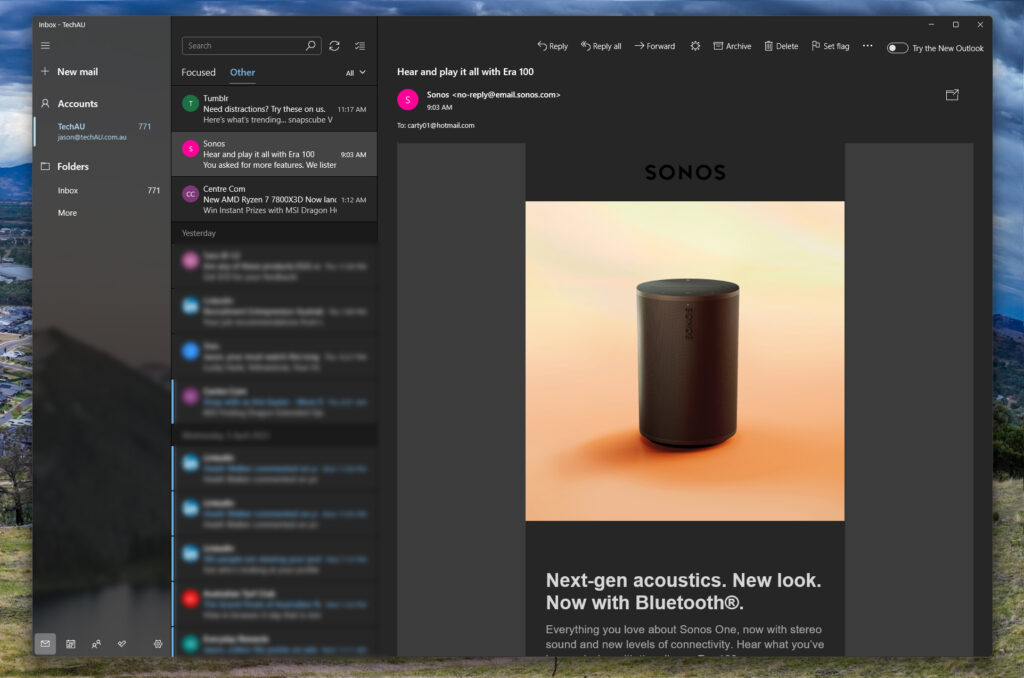
If you’ve used the built-in Mail app in Windows 10 or 11, you’ll know the app has been incredibly limited, albeit ok for basic users. For those left wanting more, Microsoft sell was to go buy Office 365 to get the full Outlook desktop app.
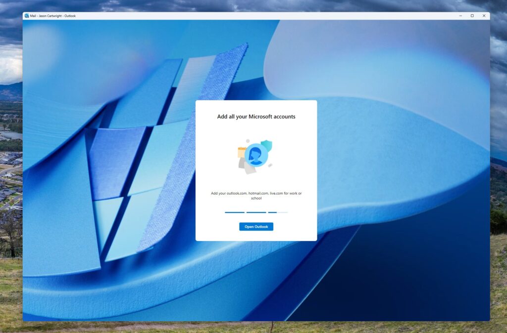
There is now an option in the Windows 11 Mail app (enable in the top-right corner) to try the new Mail app. After doing this, you’ll see a few upgrade slides and after a minute or two, you’ll be updated.
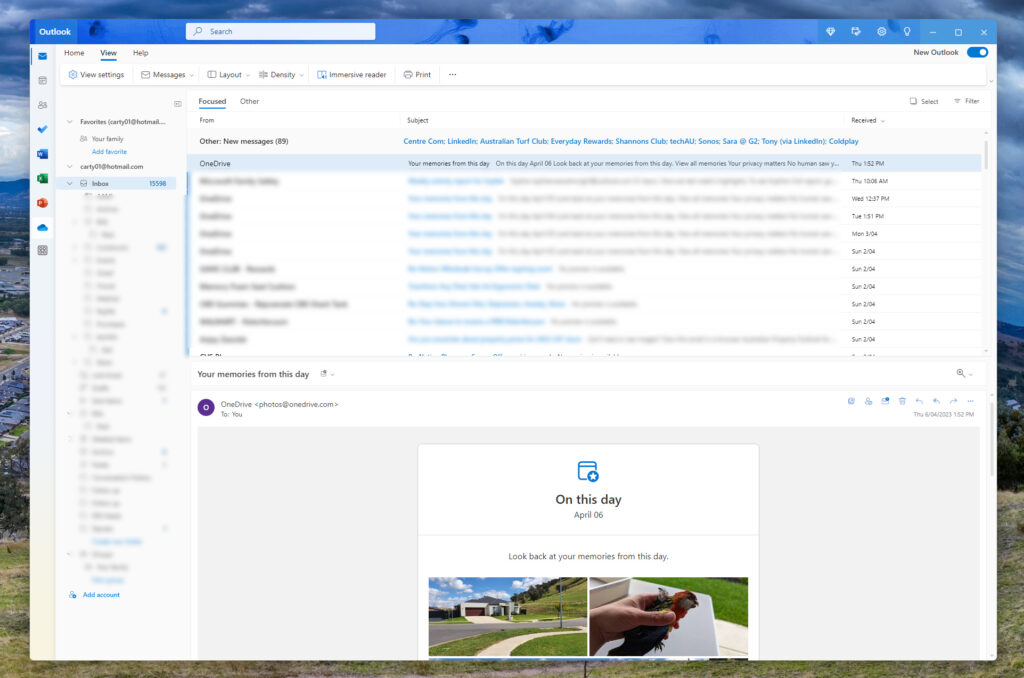
Once you’re on the other side, the layout will feel very familiar to those who’ve used Outlook or even Outlook.com. This design includes a 3-panel layout (Tips are optional on the right). on the left, Microsoft offers shortcuts to access to your Calendar and Contacts.
What is a little surprising is that the links to Tasks, Word, Excel, PowerPoint, OneDrive and OneNote, but rather than open in the same application window, these are effectively just web links that launch into your default browser.
Views can still be configured to suit your personal preference, if you want the preview pane on the bottom, you can, if you want it wider or taller, you can, if you want to show focus inbox, you can, so it starts to feel a lot more capable as a mail client.

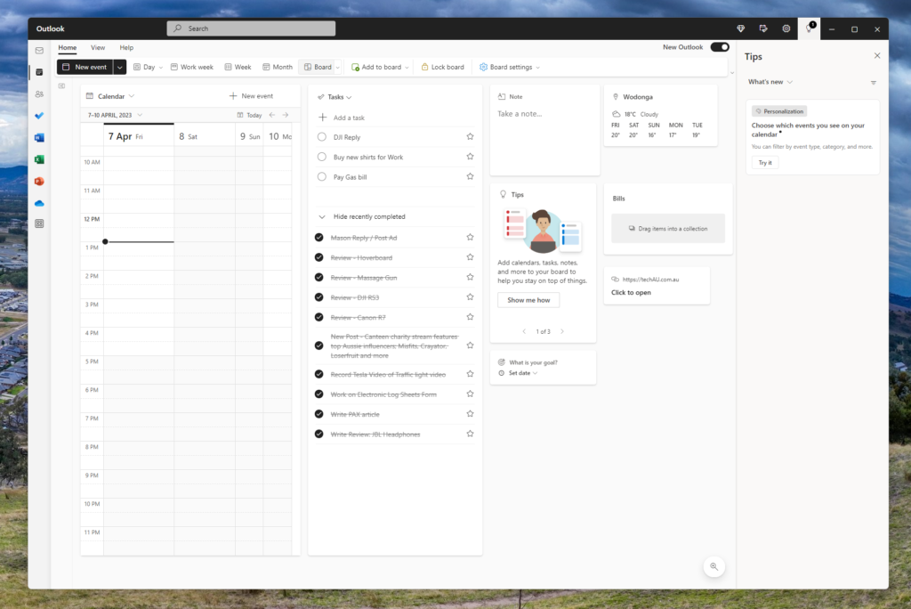
The Calendar is actually an interesting implementation. Sure, there’s the basic Calendar view, but there’s also an option to use a Board view. This Board allows you to add a range of different modules to the Board, giving you an overview of your schedule (calendar) along with tasks, but also other items like Notes, Links, Weather, Files, Location (shows business hours etc), Clock and more.
Not only can you lay out one board, but you can name these and have multiple boards. I’m not sure I’d use this a lot personally, but it’s great users have this customisation option. Once you’re done arranging, you can Lock the board.

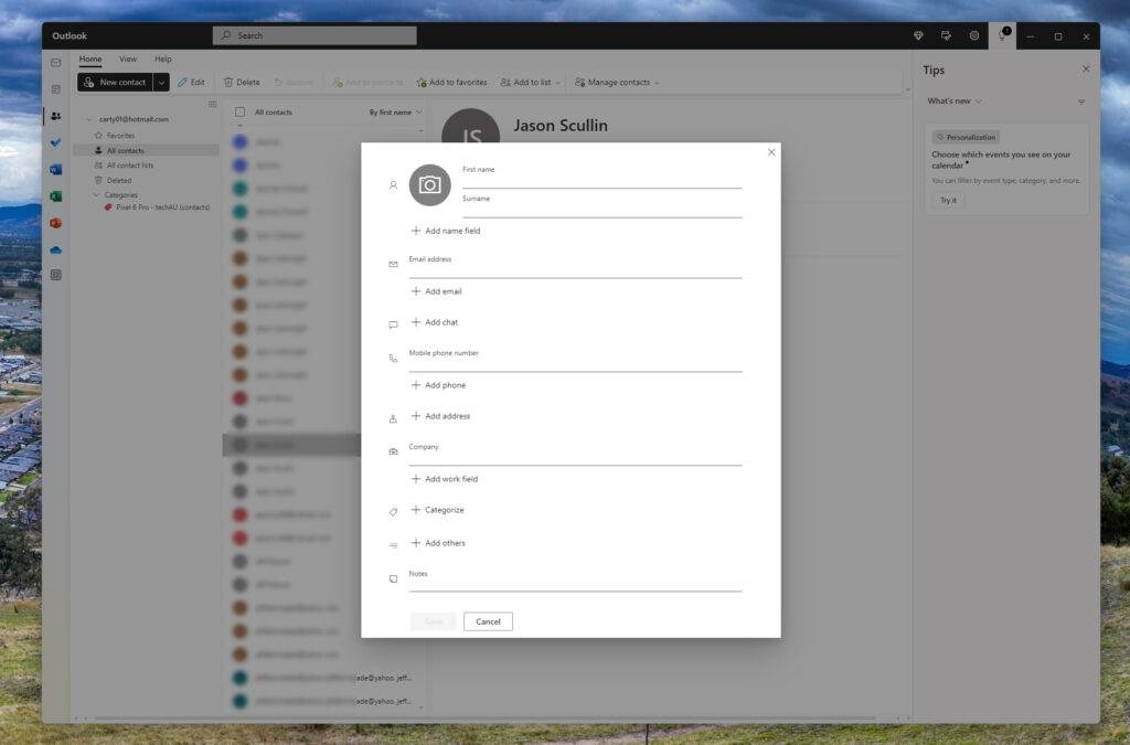
The Contact screen looks fairly comparable to what we see on Outlook.com and allows for the quick searching your contacts, great if you need to lookup an email address, birthday or phone number. Adding through the new Mail app looks clean as below.
What is lacking is the ability to integrate your social networks that already contain much of this data, particularly their profile photo.

If you try the new Windows 11 mail app and don’t like it, you can go back but disable the preview toggle in the top right… at least for a while. If you do this, you’ll be presented with a feedback survey from Microsoft which is clearly looking to understand why you’re backing away from the update.
Switching is fast, so you can go back and forward easily to compare, although expect Microsoft to stop supporting the legacy version over the coming weeks or months, to simply the developer support challenge.
