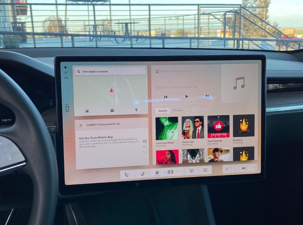
Version 11 of Tesla’s software has been a long time coming and tonight, we got our first look at a major revision of the interface. While I’m sure Tesla had hoped to keep this under wraps until an official release, the updated interface and new features have now leaked online [now deleted].
The images reveal a lot about a new design direction for Tesla, ahead of the Model S and X refresh shipping to customers. One of the big new features from the S and X is that new Yoke wheel which has no stalks, which means drive selection is being handled digitally. The setting screen shows an option to enable or disable ‘Smart Shift’, so for those users who want absolute control, its great to see this is an option.
We can see a new area on the left of the display (LHD markets) which has a vehicle icon, then dots above and below it, indicating a drag up or down will let you manually select the direction of the vehicle, in the event the AI-power gear selection chooses the wrong direction. Elon had said you’d be able to select a gear on the screen and now we see exactly what he meant.
Other big changes in the interface include this Dashboard view which gives you a macro view of Map, Phone, Music and more. We’re assuming that tapping on any of these modules will go full screen. What’s interesting is about this is the lack of an Apps button like we have today.
The leaked photos also reveal a couple of new options under the driving menu. There’s the new ‘Drag Strip Mode’. This mode is obviously dedicated to the refreshed Model S Plaid. Next to this button is a link to the help section on ‘How to Launch’. Which the Model S has had launch control for some time, its interesting Tesla are renaming this, hopefully this is still available in any location and isn’t geo-locked to race tracks.
Update
There’s now a video of V11 in action where we get to see some slick animations of the interface being used. It looks like tapping the vehicle icon brings out the control menu.
In one of the shots, we see a light pane over the left of the display which provides quick access to vehicle controls. These include lock, Frunk, Trunk, Charge port, Lights, Fold mirrors, Glovebox, and Neutral (current gear selection) at the top. In the middle we see Window lock, Child lock, a brightness slider, View clips (Dashcam), Camera (reverse). This section is completed with a new front image of the car, with the word Controls written under it, along with Mirrors and Steering wheel adjustment buttons.
At the top of this pane we see familiar icons for the driver profile (still no sense of passenger profiles), Dashcam, Homelink, Notifications, Bluetooth and WiFi.
Another image that shows a driver’s perspective of the new binnacle display shows the 3/4 display of the car. This provides us a good look at the updated wheel, with the capacitive touch buttons for turn signals, lights, horn, windscreen washers and voice control.
It remains unclear what’s going on with the Yoke vs Steering wheel, given the design studio online only displayed the Yoke. This production-ready wheel certainly suggests it’ll be a choice for owners based on their preference.
Overall the new UI is a light and bright, great looking interface that looks to turn down the bezel on the corner of objects. This is a change I personally love and can’t wait to see the dark mode equivalent.
There’s no official word on when V11 will release to existing Model 3 and Model Y owners, but we expect Tesla has a vertical version of this refreshed UI for legacy S and X cars.


Will there be multi color night ambient lights
Possible, but no evidence of that so far.